
REDESIGNING A GOVERNMENT WEBSITE
SUMMARY
-
THE PROBLEM
Users struggle to find information using the USDA website due to it’s overwhelming information architecture and page designs of varying quality
-
ROLES AND RESPOSIBILITIES
UI Researcher
UI designer
-
DELIVERABLES
Site Map
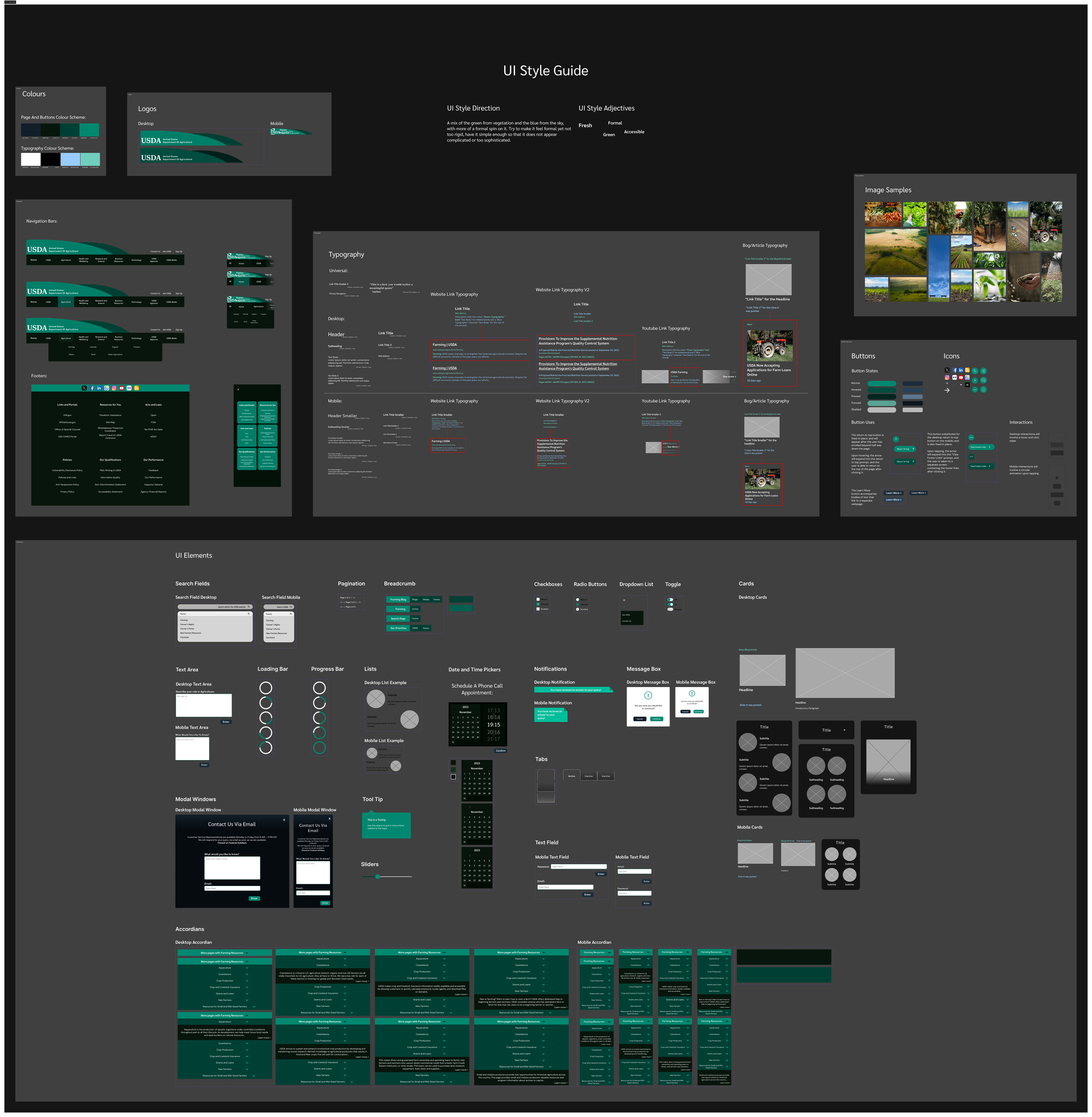
Style Guide
Hi-fi Desktop Prototype
Hi-Fi Mobile Prototype
-
THE SOLUTION:
To improve the information architecture, and provide a more consistent design for each page featured on the USDA website
-
TEAM SIZE
Research and definition conducted as a team of three.
-
TOOLS USED
Figma
Google Suite
USER RESEARCH
Before testing the website to discover which aspects we could improve on, we defined a proto persona, Bill Gibson.
We envisioned that a typical user of the USDA website would work in agriculture, and need to find information relating to maintaining and growing their farm, and that they would struggle to navigate the website due a lack of time to figure out what it offers and a cluttered design.
We identified the path Bill would likely take on the website. We believed that, as a new farmer, he would want to start expanding his business. He would therefore need to investigate loans and grants, and would visit:
Homepage
Search Page
‘Farming’ topic
‘Grants and Loans’ page
‘Farms and Loans’ page
CONDUCTING AN HEURISTIC EVALUATION
We also conducted an heuristic evaluation of the website to discover what aspects of the design we could improve upon, and an accessibility evaluation to find out which aspects of the website needed to be improved to become more accessible to a wider range of users. We then focused on the navigation, and tested 4 users's ability to navigate the current USDA website.
USABILITY TESTING
We wanted to define the main pain points users experienced while navigating the website, and which features aid and restrict the user’s experience.
We therefore tested 5 users on their ability to complete four tasks within the website, and recorded their insights.
INSIGHTS
The most common pain point users faced related to the navigation bar. Every user spent time clicking on each section within the navigation bar, and reading through it in vain when trying to achieve each task.
DEFINITION AND SYNTHESIS
We found that some specific navigation features were not clearly interactable, and others seemed to blend in with their backgrounds.
DESKTOP INSIGHTS
The desktop insights showed three main areas to focus on when creating our website:
An emphasis on user familiarity: social media button where they expect it to be, logo acting as a link to the home page, etc.
Make components uniform, so there is greater consistency
Ensuring efficiency for the user: making the search bar easier to access, visual components to break up text and making the site more readable to the user.
MOBILE INSIGHTS
Mobile insights were similar to the desktop, with more of a focus on accessibility (Social media icons were said to be too small to notice, and the placement of the home navigation within the menu felt odd to some users).
IDEATION
I conducted card sorting in order to identify a less overwhelming way of presenting the information within the navigation, resulting in 8 sections within the primary navigation, each with no more that 7 secondary navigation pages.
REDESIGNED SITE MAP

PROTOTYPING
I prototyped navigation for the desktop and mobile first, then produced the rest of the homepage ready for testing. After assessing the hierarchy through testing I started to design the hi-fi desktop and mobile homepage, with wireframes for four other pages within the website. I first created a Style Tile to ensure my design is consistent throughout the prototype, before applying it to the homepage and other wireframes. After testing that prototype once more, I produced a style guide and iterated the final high fidelity prototype for the mobile, changing the size of the navigation within the page to align with my testing insights.
TESTING
MID FIDELITY 5 SECOND TEST:
I conducted five ‘5 second user tests’ on both the desktop and mobile prototypes. In order to assess the hierarchy presented within my prototype. Users are attracted to features that are isolated, and avoid areas of white space and areas of high congestion. Therefore, I should isolate features of high importance and make sure there is enough contrast to the white space around such features, as users are likely to miss them otherwise.
HIGH FIDELITY TESTING:
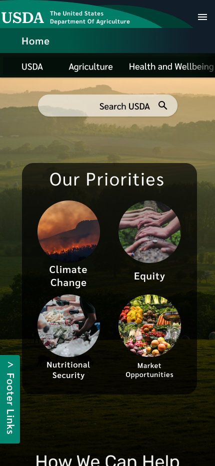
I tested 7 different people on both the desktop and mobile prototype, having them navigate to each page while discussing their process. After prioritising my user insights, I redesigned the footer button and page, and redesigned the navigation bar to allow for more navigation space and for titles for each page. I also made each icon on the priorities section take the user to a separate part of the page. I then fixed the overlapping on the blog page and added large quotation marks to help the quote stand out as a quote.
FINAL PROTOTYPE

CONCLUSION
I had intended to improve the navigation of the USDA website, making the secondary navigation less overwhelming, and appealing to the habits of users by emphasising the search function.
Due to time restrictions, I had been unable to fully consider iterations to the desktop prototype. Along with applying the iterations identified during my insight prioritisation, I would consider breaking up the first tile of cards allowing for a greater use of white space and making the landing page less overwhelming overall.
While studying the website during this process, I struggled to understand who the USDA was in the beginning, due to the vast amount of different topics included within the website. This was also reflected during testing, as users easily misunderstood tasks under the incorrect assumption about the meaning of specific topics included within the website. I would therefore also consider adding a short paragraph detailing who USDA is, and their purpose as an organisation, in order to give context to those who visit the page for the first time not knowing anything about them.